Gardens · garden color by light
Choose Flower Color Relationships for Sun, Shade, and Evening
Build flower palettes from relationships—analogous, complementary, or monochromatic—then adjust their value, proportion, foliage, and repetition for bright sun, open shade, and evening viewing.
Published Last updated
In this guide
- Start with the hours when the garden is seen
- Read color as a relationship, not a label
- Let bright sun carry strong contrasts
- Use open shade to reveal value and edge
- Compose evening views with reflected light
- Give one color more visual weight
- Build continuity with foliage and hardscape
- Test bloom overlap before buying
- Make small field trials in the actual light
- Compare white and purple in a measured summer bed
- Design ideas
Start with the hours when the garden is seen
A flower color does not have one fixed garden effect. It is seen beside foliage, soil, paving, walls, and other flowers, under light that changes by hour and season. Begin by naming the view that matters: a sunlit approach at midday, a shaded border from a kitchen window, or a seating area used after work. That viewing condition is part of the palette, not a detail to consider after the plants are bought.
Stand at the actual viewpoint on a clear day and an overcast day. Record where direct sun lands, where the site remains open to the sky without direct rays, and when the bed falls into shadow. Open shade can still be bright, while a corner beneath dense evergreen foliage may be genuinely dark. Plant suitability comes first; color planning cannot make a sun plant healthy in insufficient light.
Include the background in the inventory. Warm brick, cool gray siding, pale gravel, dark evergreen foliage, and weathered timber each change how petals appear. University of Georgia guidance notes that surrounding context affects color perception. A white wall may amplify already bright flowers in sun, while deep green foliage can give a pale flower the edge it needs in shade.
Choose one principal viewing season rather than pretending every flower overlaps all year. Bloom records vary with climate, weather, and cultivar. Use local references and your own photographs to confirm which colors will actually meet. Foliage, bark, seed heads, and hardscape can carry the relationship when flowers are absent.
Read color as a relationship, not a label
An analogous scheme uses neighboring hues, such as blue, blue-violet, and violet. Because the colors share visual properties, they blend easily and can make a generous drift feel continuous. The relationship still needs value contrast: pale lavender against medium green is legible, while several equally dark purples may merge from the main viewing distance.
A complementary scheme pairs colors opposite one another, such as violet and yellow or blue and orange. The contrast makes both sides more conspicuous. University of Georgia guidance recommends allowing one color to dominate rather than dividing the planting into equal competing amounts. Treat the second color as a repeated accent that directs the eye, not as a checkerboard.
A monochromatic scheme develops one hue through tints, shades, and related foliage. It is not a bed of identical flowers. Pale blush, mid-pink, deep rose, burgundy stems, and green leaves can create depth while preserving unity. Form and texture become more important because hue contrast is restrained, which makes this relationship particularly useful where the garden should feel calm rather than emphatic.
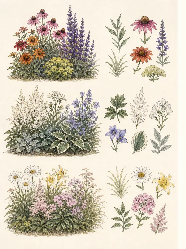
These relationships are tools, not rules about taste. A lively mixed border can use several hues if repetition gives the eye a route through them. A quiet planting can still include a sharp complement at one focal point. Define the intended hierarchy—dominant field, supporting transition, and accent—before matching plant names to the plan.
Let bright sun carry strong contrasts
Bright sun increases the apparent force of white and warm colors and can flatten subtle pale differences. In an exposed border, give the eye enough mass to read a chosen hue from the viewing distance. A few isolated orange flowers may look accidental, while a repeated warm drift can balance the visual weight of a broad violet group. The plant choices must still tolerate the site’s heat and moisture pattern.
Complementary pairings work well when one side is visibly dominant. Build a violet field from repeated spires and rounded flower heads, then thread yellow through it at fewer, deliberate points. The green foliage is not empty space; it moderates both colors and prevents constant high contrast. Repeat the accent far enough apart that it creates rhythm rather than a single unrelated spot.
Analogous warm colors can hold together under strong light if their values differ. Deep red, red-orange, and amber may collapse into one hot band when every flower has equal intensity. Add dark foliage, quieter tan seed heads, or a pale neutral interval to separate forms. Conversely, a cool blue-violet sequence can feel more expansive when repeated toward the far end of a view.
Test pale colors at noon before committing. Some pastels lose definition in glare, especially against light paving or a pale wall. They may need darker foliage, a shaded background, or a stronger neighboring value rather than a brighter flower. The useful question is whether the flower edge remains visible from the chosen viewpoint, not whether the catalog name promises a particular mood.
Use open shade to reveal value and edge
Open shade receives diffuse sky light without sustained direct sun. In this softer condition, white, cool hues, and dark colors can appear clearer than they do in glare, while some warm colors lose force. Use that shift deliberately. Pale flowers and cream-variegated foliage can mark the path of the border, while deep green or burgundy leaves provide the edge that keeps them from dissolving into brightness.
Value—the lightness or darkness of a color—often matters more than the precise hue in shade. A pale blue flower and a white flower may function similarly from across the garden, while a dark violet beside black-green foliage may disappear. Place a mid-value leaf, silvered surface, or pale neighboring bloom between close dark values when you want the flower form to remain legible.
A cool analogous sequence is an intuitive fit for open shade, but it should not become a row of near-identical small flowers. Alternate flower shapes and foliage scales while repeating the hue family. Broad leaves catch diffuse light, fine leaves make a quieter ground, and vertical stems lift a pale accent above the lower layer. This lets structure carry the design after the flowers finish.
Do not use whiteness as a substitute for horticultural fit. A white-flowered sun perennial will not perform merely because white is visible in shade. Select plants proven for the measured light, soil moisture, heat, and region, then choose among their colors. Design begins with viable plants and arranges the available palette.
Compose evening views with reflected light
At twilight, strong daytime reds, blues, and purples lose prominence while pale flowers and white, silver, or variegated foliage remain easier to see. University of Missouri Extension recommends white, ivory, pale yellow, lavender, silver, and gray for twilight gardens. Use those light surfaces near the place where people actually sit or pass, rather than distributing them evenly through the whole property.
A successful evening planting is not a daytime border recolored entirely white. Keep form, silhouette, and texture active: an upright pale flower, a low silver leaf, a rounded cream bloom, and a moving grass can remain distinct as hue information fades. Dark foliage behind a pale form increases edge contrast, while a pale wall behind it may reduce definition unless the plant has a strong silhouette.
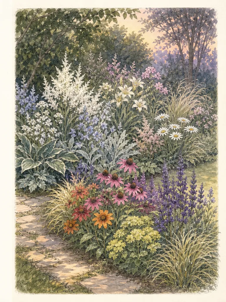
Place the lightest group where remaining sky light or moonlight can reach it. A bed under a dense canopy may not receive enough reflected light to glow, and an exterior floodlight changes the visual problem entirely. Observe the site at the intended hour before deciding. If safety lighting is necessary, keep it task-focused and follow local electrical and wildlife guidance rather than designing the planting around excessive illumination.
Fragrance and sound can enrich an evening garden, but cultivar identity and regional behavior require checking. Do not assume that every white-flowered selection is fragrant at night or that a plant listed for another climate will be appropriate locally. Color remains one layer of a site-matched planting, not a reason to overlook hardiness, invasiveness, mature size, or water needs.
Give one color more visual weight
Equal amounts of two high-contrast colors can make the eye jump back and forth without rest. Establish a dominant field and use the complement as punctuation. Dominance can come from a larger planted area, longer bloom duration, broader foliage mass, or repeated placement. It does not require counting individual flowers, whose abundance changes through the season.
Visual weight also comes from brightness, size, and form. A small group of intense yellow flowers may balance a much larger area of muted violet. One coarse white hydrangea bloom can command more attention than many tiny pale flowers. Judge the groups from the actual viewing distance and adjust mass, not just plant quantity on a shopping list.
Build a neutral interval where the contrast needs relief. Green foliage, tan stems, gray stone, and quiet mulch can separate two active groups without adding a new hue. The interval also gives each plant mature space. Empty ground at planting is not a color failure; crowding for instant coverage can erase the planned hierarchy as plants reach full spread.
Repeat the subordinate accent enough to connect the composition. One yellow flower at the entrance and another toward the destination can lead the eye through a violet field. If the accent occurs only once, it acts as a focal point; that may be correct, but it should be intentional. Use the plan to decide whether the color leads, anchors, or simply interrupts.
Build continuity with foliage and hardscape
Flowers are temporary, so repeat the palette through leaves, stems, bark, containers, or paving already present. University of Florida guidance identifies color in both plant material and hardscape and emphasizes the longer-lived roles of form and texture. A bronze leaf can carry a warm relationship before orange flowers open; a blue-gray leaf can connect violet bloom periods separated by weeks.
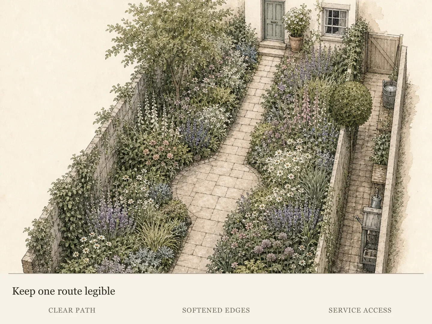
Treat the house and path as existing colors, not neutral voids. A violet-yellow complement may feel sharper against cool gray paving and warmer against brick. Bring material samples beside plants in the actual light. Avoid choosing every flower to match a painted surface exactly; a related value or repeated accent often creates stronger unity than literal color matching.
Use green deliberately. Yellow-green foliage can warm a cool analogous scheme, blue-green can quiet a hot one, and deep evergreen masses can provide the contrast pale flowers need in shade or evening. Variegation has high visual activity, so repeat it sparingly and allow plain foliage around it. Several unrelated variegated patterns can fragment a small bed even when their colors technically match.
Plan the off-season version at the same time. If the flower relationship disappears after a short overlap, decide what remains: repeated leaf forms, seed heads, evergreen structure, or a clear bed line. A palette that depends only on a nursery’s peak display may leave no coherent garden once those particular flowers close.
Test bloom overlap before buying
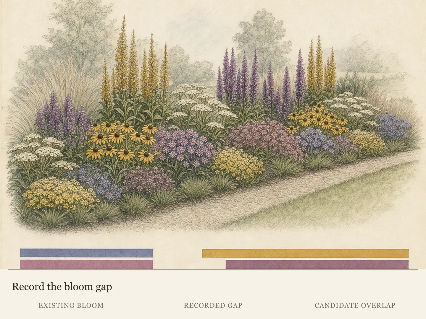
A color combination exists in the garden only when its components are visible together. Compare local bloom records and cultivar notes, then mark broad windows rather than exact dates. Weather, elevation, plant age, and care can shift flowering. Build some overlap through foliage color so the relationship does not vanish if one flower begins later than expected.
Photograph the bed from a fixed point every few weeks through the main season. The record reveals gaps that memory smooths over and shows whether an accent repeats or clusters in one corner. Use it to move future additions on paper before moving established plants. A single season is evidence, not a universal timetable; unusual weather deserves a note beside the image.
When buying in bloom, compare plants outdoors rather than under retail lighting when possible. Hold them near a sample of the background material and step back. Named colors are inconsistent across catalogs, and petals change as they age. The relationship between the actual plants is more useful than deciding whether one is correctly called apricot, coral, or salmon.
Preserve cultivar names in the plan. Color, height, bloom timing, and hardiness can differ within a species, and a later replacement needs the same identity if continuity matters. If the cultivar is unavailable, reassess the role—dominant mass, transition, or accent—rather than substituting any plant with a similar marketing photograph.
Make small field trials in the actual light
Before renovating a whole border, assemble a temporary trial with nursery pots or removable containers. Group the proposed dominant, support, and accent colors at approximate mature proportions. View them in bright sun, open shade, and the intended evening hour where relevant. Pots distort height and mass, but the test exposes value clashes and disappearing dark colors before permanent planting.
Use neutral cards or pieces of the real paving behind individual flowers to separate background effects from plant effects. Move one variable at a time: change the proportion of yellow, add a darker leaf behind white, or replace a warm transition with a cooler one. A useful trial answers a design question; constant rearrangement without a stated question produces preference fatigue rather than evidence.
Record the combination in color and grayscale photographs. The grayscale view is a simple way to compare value structure: if every group becomes the same gray, flower forms may merge in low light even when their hues differ at noon. This is a design aid, not a biological test, and it should be paired with the plant’s actual site requirements.
Commit first to the relationship and hierarchy, then to locally suitable plants. Allow the planting to mature before filling every interval. Edit after observing a full sequence of light and bloom, keeping the colors that carry their intended job and removing accents that compete. The goal is not a perfect color wheel in soil; it is a legible garden at the hours it is lived in.
Compare white and purple in a measured summer bed
For an illustrative Zone 6 Pennsylvania trial, use a sunny 12-by-6-foot bed with moist, well-drained soil. Place two white-flowered Phlox paniculata 'David' at (3, 4) and (9, 4) feet from the front-left corner, allowing each a 3-foot mature circle. Put three Echinacea purpurea at (2, 1.25), (6, 1.25), and (10, 1.25), each with a 2-foot circle. All five footprints fit without overlap, and the front plants remain reachable from the path outside the bed.
The white phlox and purple coneflowers supply an actual color comparison in their overlapping summer display; their exact local bloom overlap still needs observation. Look from the same seat in morning, midday and evening, recording which group remains legible against the real background. Do not report a winner before seeing those conditions. Outside this climate or moisture regime, keep the comparison method but replace the plants and recalculate their full widths.
Design ideas
- Style
- Light-responsive ornamental border with a restrained dominant palette and repeated accents
- Space
- Sunny border, open-shade planting, or garden area viewed from late afternoon into evening
- Climate
- Temperate ornamental garden; plant hardiness, heat tolerance, soil moisture, bloom overlap, and the meaning of full sun or shade must be verified locally before color is used as a selection filter.
- 1Sunlit violet with a yellow thread
Build the main field from locally suitable violet and blue-violet flowers in repeated forms, then use a smaller amount of yellow as an accent at the entrance, middle, and destination. Keep green intervals between the strongest contrasts and test pale components at midday so glare does not erase their edges.
- 2A cool analogous shade ribbon
In open shade, move through blue-green foliage, pale blue flowers, lavender, and violet without treating them as identical. Alternate broad and fine leaves, include one lighter value in every repeated group, and place the darkest flowers against a mid-value or pale leaf so they remain visible from the principal viewpoint.
- 3One hue through several values
Choose a monochromatic family such as pink and arrange pale blush, medium rose, and deep burgundy as distinct value roles. Let the lightest value mark a path or seat, use the middle value as the repeated field, and reserve the darkest for edges and stems that keep the composition structured after bloom.
- 4A twilight pocket beside the seat
Concentrate white, ivory, pale lavender, and silver foliage near the place used in the evening. Vary silhouettes with one upright, one rounded, and one low spreading form. Back the palest group with dark foliage, confirm the position receives remaining sky light, and keep any necessary path lighting low and task-focused.
- 5Borrow a color from the house
Select one muted color already present in brick, painted trim, stone, or a container and repeat a related value in foliage or flowers. Use it as a bridge rather than an exact match. Then add one restrained complementary accent so the border belongs to the setting without becoming a literal copy of the building.
- 6Carry color with foliage
Use blue-gray, bronze, yellow-green, or cream-variegated foliage to connect separate flowering periods. Repeat one foliage color in at least two zones and surround active variegation with plain leaves. This keeps the palette legible when flowers pause and prevents a collection of short bloom events from reading as unrelated spots.
- 7Trial the same palette at three hours
Stage the proposed plants in pots and photograph them at midday, in their normal shade period, and at twilight. Note which edges vanish, which accent becomes dominant, and whether the background changes the balance. Revise proportion or value first; replace plants only when the color role or the horticultural site match truly fails. Label each frame with the viewing direction and weather so a bright overcast trial is not mistaken for direct sun. Place a simple grayscale copy beside the color image to reveal value collisions, then compare the same grouping from the seat, doorway, or path where it will normally be seen. Record one decision after each viewing period: retain the hierarchy, enlarge the pale mass, quiet the accent, or change the background relationship.
Plants in this guide
Related reading
Sources
- Landscape Basics: Color Theory. University of Georgia Extension. Source record · Accessed 2026-08-19.
- Basic Principles of Landscape Design. University of Florida IFAS Extension. Source record · Accessed 2026-08-19.
- Hang the Moon with Twilight Gardens. University of Missouri Extension. Source record · Accessed 2026-08-19.
- Phlox paniculata. NC State Extension. Source record · Accessed 2026-09-09.
- Echinacea purpurea. North Carolina Extension Gardener Plant Toolbox. Source record · Accessed 2026-09-09.
- Phlox paniculata 'David'. NC State Extension. Source record · Accessed 2026-09-09.